Sunday 13 May 2012

Scott McCloud (final)

Scott McCloud

 Finally I have chosen to write about this artist in more detail because I have an interest in graphic novels of which inspired me to start drawing in the first place ( I originally wanted to become a graphic novelist) but also that he hasn't gone with trying to draw to please the audience alone but instead please the audience by going beyond & testing the boundaries of comic design itself. He has experiemented with interactive comics & released many help guides for young new comers to the comic industry.

Zot!, by Scott McCloud

 The illustrations of his comics are quite simple compared to those of bigger companys such as Marvel & DC however I think the comic is quite well put together as the text, tones & actions give the comic so much more depth that the audience can easily engage with the characters. The flow of the story is very well portrayed & the emotions that McCloud shows within the illustrations come across well especially the anger of the top right panel. With a bolder, capital typeface he understands that this will create an intimidating feeling towards the audience, this is complimented with the dark shadows of block colour around the character's eyes. This is a vital area to make intimidating because the eye contact is the main way the audience interacts with the character. The use of this contrast between the whites of the eyes & the shadow makes the character's expression that more intense.

 I would like to take ideas from his comc style & practise the use of tone to portray a character's emotion. I may experiment with this other the summer.

Pete Fowler

Pete Fowler

Fowler is most definately my favourite out of all the artists I have researched for this project. I as an illustrator can relate to his style the most with his psycadelic inspiration, think lines & bold colours. His artwork mostly consists of strange creatutes which can be comical & you can really get a sense of the depth of his character design within each one.


I love how clean the linework is in this piece, the smoothness is that you would expect from a vector piece so I am going to assume that it is! I love how the lines all flow together smoothly & that everything is spread out evenly. The piece being perfectly symettrical I feel helps the illusion of smoothness throughout the piece. I feel in the future I will experiment with making my work more symettrical so I can query whether this creates the same illusion for my illustrations too.

The bold use of colour also create a strong contrast from the lines to make the image really pop out. The use of colour is necessary as if pale colours were used they would be washed out by the intesity of the linework unless the lines were toned down to a light grey.

Ian Pollock (final

Ian Pollock

To be honest Ian Pollock isn't one of my favourite artists I have chosen out of the 4 of them. The reason I chose him eas because his illustrations were somewhat surreal which is what I like to incorperate into my own illustrative style. However, even though I also enjoy working in traditional media, Ian Pollock also does however he used the tools very differently.


This is a pretty comical image & like I said he does have it's surreal aspects. However what I would really like to focus on is the line work. It appears that the artist has used a dip pen & ink for this lineart as the lines are very sketchy, varying from heavy to fine & the lines don't connect. In areas such as underneath the scooter,the ink has blended into the area of shadow which creates a more intense contract.

This line art also suits the method & media of colour of which being water colour. Instead of being clean & previse with the strokes, he has been more expressive. Lashing of colour to produce depth works well however he has still kept the colour within the lines.

 I would take inspiration from this messy style however I think I would slowly die on the inside as I have been aiming to be as clean as possible with my lineart through all my life drawing.

eBoy (final)

eBoy (Chosen artist 1)


The reason I chose to write a more detailed post about eBoy would be that the complexity of his drawings remind me of my personal illustrations as I love to include a lot of extra details that cause the public to double take, you can not see everything with only one look at the piece. Furthmore the choice in colour is vivid allowing the image to feel more "busy" giving it a greater sense of depth. These pieces are very imaginitive & with a simply, pixel style they can pull it off without making it feel cluttered whilst maintaining a high standard.


bike repainted

by Andreas Stokbro

This is a great example of how flexible the designs of eBoy are. They can be applied to many forms of merchandise because the design is so complicated. With other artwork you may be concerned if it was placed onto a bike even though it wasn't designed to fit the frame because the image would be cut up & the audience wouldn't be able to interperate what it was. However because it is so busy it gives the same effect of a pattern. It looks great on said product & I especially think it would be excellent as a wallpaper.
Rio Wiggle

Rio Wiggle

 This is amazing! I love how despite the animation is so simple, due to the complex design of the drawing, it makes the animation look complex too! I can see that this is constructed using 3 - 4 seperate layers of which the artist have moved the layers (except the background layer) side to side which would only take a few frames. This is looped over & over so this couple possible be a high resolution gif? Afterall it has allowed me to copy it straight from the site. I really love the use of gradient to shade the statue but also I really love the heart ballon as it's simplistic but it stands out to me. The use of red on white has probably created the contrast of which grabbed my attention. I can honestly say I would enjoy looking at this for hours & am probably going to purchase Pixorama for myself!

Saturday 12 May 2012

Ross Collins

Ross Collins

Collins was born in 1972 Glasgow where he remained to study at the Glasgow School of Art. In 1994 he graduated from said school with a First in Illustration. But impressively he also won the MacMillan Children's Book prize which presented him many oppurtunities & kick started his career as a children's novel illustrator.

He spent 2 years in London taking advantage of said oppurtunities however he missed his home back in Scotland & returned where he now spends his time continueing to illustrate/write children's novels & create animation character development.

Awards include

'Dear Vampa' won the
2011 Scottish Children's Book Award
White Raven Award 2012 (Germany) for
'When I Woke Up I was a Hippopotamus'
'Billy Monster's Daymare' won the
2008 Royal Mail Book Award
'The Elephantom' was shorlisted for the
Kate Greenaway Medal 2007
White Raven Award 2003 (Germany) for 'Busy Night'
'Alvie Eats Soup' gained an Oppenhiem Award. (US)
Blue Peter Book Award Nominee
Young Hoosier Book Award Nominee
Scottish Arts Council Book Award 1999
'Supposing' gained a Blue Ribbon Award (US)
the Scottish Arts Council Book Award 1999
and was a nominee for the Blue Peter Book Award
and the Young Hoosier Book Award

Winner of the 1994 MacMillan Prize for
'The Sea Hole'.


Reference
www.rosscollins.net/
[All electronically accessed & submitted]

Sara Fanelli

Sara Fanelli

Despite being born in Florence in 1969, she moved to London to study at the Camberwell College of Art & then Progressed onto the Royal College of Art of she graduated in 1955. Fanelli is both an artist & illustrator however is best known for her work on illustrated children's novels which were so sucsessful that they were published in man languages & have won her awards. Theseawards include winning the Victoria & Albert Musuem Illustration Award, a D&AD Silver Award for a poster design in 2003 & finally for a postage stamp in 2000.


References

www.sarafanelli.com
www.en.wikipedia.org/wiki/Sara_Fanelli
[All electronically accessed & submitted]

Scott McCloud

Scott McCloud


McCloud is a very well know graphic novelist who has revolutionised comics & began producing them proffesionally since 1984. He he best known for:


Non Fiction books such as his Understanding Comics which was produced in 1993. The book is 215 pages long which is a comic about comics medium & is translated into over 16 different languages. Reinventing Comics was published in the year 200 which takes a more controversial direction in terms of comics which focusses upon how art can be revolutionary, aswell as insights to culture & technology. Making comics was produced in 2006 to help new comers by explaining story telling techniques. This proved popular & resulted in the Making Comics 50 State Tour aswell as the Google Chrome comic.


References
www.scottmccloud.com/
www.scottmccloud.com/5-about/index.html
[All electronically accessed & submitted]

Alan Herron

Alan Herron

He started his career working for the company Allied International Designers which were based in London, then transferring to Lloyd Northover he designed RSC programmes & posters, brochures for IBM & magazines for BT. After being able to get work with large clinets under his belt he joind Michael Peters Group working mostly on annual reports & once again brochures. He later became a designer of which worked in both 2D & 3D design for retailers such as Next & WH Smith whilst he worked at David Davies Associates.

Feeling confident, he gathered past colleagues from Lloyd Northover & formed the company Giant. They did an excellent job of keeping the buisness afloat over 11 years & they proved very sucessful. However towards the end the financial for them & many over designers across the country was awful. They ended up selling the buisness for £67.30!!

However glad to of escaped this kind of work, he now works as joing Creative Director for True North.


References
www.thedisciplesofdesign.co.uk/preston-profiles/alan-herron

www.thedrum.co.uk/.../joint-creative-director-alan-herron-leaves-tru..

[All electronically accessed & submitted]

Frith Kerr

Frith Kerr

Kerr is a well celebrated graphic desginer who has had an excellent education studying at Camberwell College of Arts from 1992-1995 & then progressed to the Royal College of Art from 1995-1997. She co founded a very sucessful studio known as Kerr/Noble with Amelia Noble of which she directed for eleven years. Then eventually she moved out into the design industry setting up her own studio, Studio Frith which is situated in Borough, London.

As an incredibley talent she applies her skills to work with a wide variety of media & objectives such as books, posters, typefaces, identities to exhibition, design, signage, websites for quite a few buisnesses who were both corperate & cultural. These include: Arts Council, Barbican Art Gallery, Caruso St John, Channel 4, David Chipperfield Architects, Liberty, Modern Art Oxford, Selfridges, Shakespeare Globe, Serpentine Gallery, Tate Modern and Tate Britain, Heatherwick Studio, and Oglivy & Mather NY

The british newspaper, The Independent list her as one of the top ten designers in the UK as of 2002 & then in 2007 The Guardian stated she was in the top 50.

Awards
2010 Grafik Award for Quick, Quick, Slow
2010 Restaurant and Bar Awards, Best Identity and Website
2006 D&AD Silver Nomination
2003 Arts Foundation Award for Graphic Design
2002 Creative Futures Award for Editorial Design, Creative Review
2002 Best of Show, Design Week Awards

Refernces

www.studiofrith.com
www.artsfoundation.co.uk/Artist-Name/all/295/Kerr-Frith
[All electronically accessed & submitted]

Dave Brown

Dave Brown

Born in 1961, Brown is well known as a British political cartoonist for the Independent. Political cartoons are a comical & simplistic way of reflecting the political situation to the public but also to poke fun of the politicians (of which is typical for people to detest).

However it wasn't his mockary of the british politicans that caused controversy but his illustration of the former Israeli Prim Minister, Ariel Asharon. He depicted said Minister as a "Monster eating Palestinian babies" which was inspired by the vulgar paiting by Francisco De Goya, "Saturn Devouring One of his Children" painted in 1819. Despite the shock factor of the illustration, it allowed him to win the Political Cartoon of the Year award in 2003.


 This illustration does catch my attention as anything controversial inspires me greatly. I may experiment & attempt political cartoons one day as I enjoy the thought of shocking the public in such a manner.

Michel Gondry

Michel Gondry

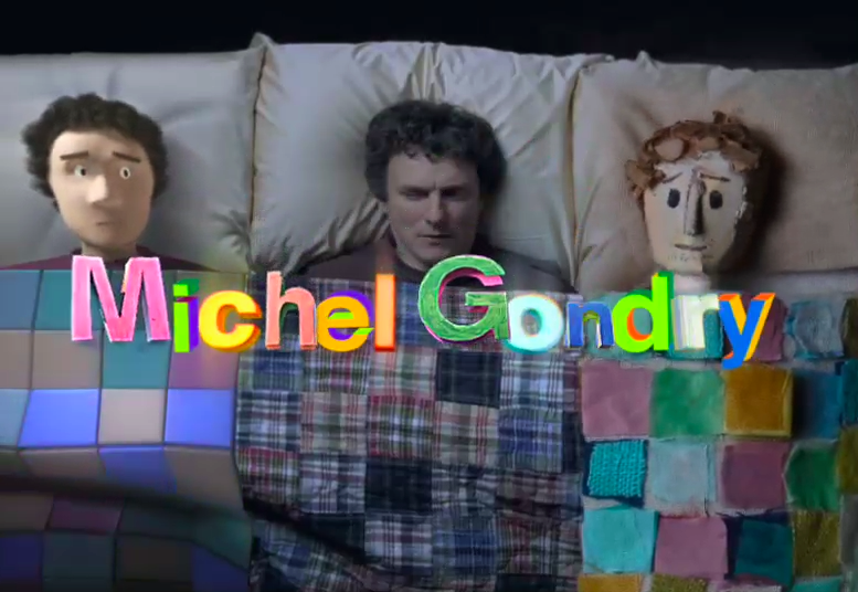
Born on the 8th of May 1963, is a filmmaker who is involved in with being a commercial director, a music video director & a screenwriter. His inventive visual style & manipulation of mise en scene has earnt him recognition as a promising filmmaker aswell as an Academy Award.

Gondry had creativity pulsing in him veins as he was born into a very creative gene pool. His grandfather was the famous inventor, Constant Martin & his son also carried this on & became an artist. Gondry was originally born in Versailles, France.

He orignally became a music video director debuting by assiting the music videos for the french rock band Oui Oui of which he also participated in by playing the drums. However instead of his musical talents catching the publics eye, his video directing caught the attention of Bjork & asked him to direct her vidseo for the song Human Behaviour. Many artists have enjoyed collaborating with him on videos for bands such as Daft Punk, The White Stripes, The Chemical Brothers, The Vines, Steriogram, Radiohead & Beck. He also inveted the technique "bullet time" which was famously applied to the Matrix films later on.

Spike Jonze & David Fincher have also worked with Gondry


References

www.en.wikipedia.org/wiki/Michel_Gondry
www.imdb.com/name/nm0327273
[All electronically accessed & submitted]

Daniel Brown

Daniel Brown

Based in the UK, he is a sucessful designer, programmer & artist who's expertise lie in the areas of creative digital technologies, interactive designs & applied arts. He is a very talented programmer who is very knowledgable in popular, modern software such as flash & java. He can apply this knowledge to design apps & websites to a high standard however teamed with his great sense of creativity he can turn it into a work of art.


His experimental work of applying art to programming & his many of his other talents have earnt him exhibits in places such as the San Fransisco Museum of Modern Art aswell as the London's Vctoria & Albert Museum. He has been awarded the London Design Museum's Designer of the Year in 2004 & then selected at one of the 80 people who will degin the next 10 years by the Observer. Also he is one of the hottest 50 designers to be invited to Buckingham Palace in celebration of British Design.


References

www.danielbrowns.com

www.designmuseum.org/design/daniel-brown
[All electronically accessed & submitted]

Fernando Gutierrez

Fernando Gutierrez

The designer formed a studio name after himself of which specialises in graphic design. The team members all participate by taking the roles of consultants & project leaders for creating cooperate identities & solving design briefs across all media. Normally, the designers prefer to work with the clients long-term which means their loyality often leads to the company making partnerships with said client. They always ensure that their clients are prioritised & the work is fast aswell as profitable.

A Spanish couple gave birth to Guiterrez in 1963, London where he stayed all his life to stufy at the London College of Printing of which he graduated with honours in 1986. In the past he had wprked with CDT Design based in London, Summa based in Barcelona & then eveutally formed his own group called Grafica with Pablo Martin. In 2000-2006 he worked with the largest design company in the world, Pentagram but then left to move on to his onw studio group.


References

www.fernandogutierrez.co.uk/
www.greatwesternstudios.com/.../364-studio-fernando-gutierrez
[All electronically accessed & submitted]

Vaughan Oliver

Vaughan Oliver

Orignitating from Epsom, South London, Oliver was borin in 1957 & became a well noted graphic designer. Vaughan Oliver formed the design studio 23 Envelope with photographer Nifel Grierson. They were well known for their work for the record label 4AD of which comissioned them for every band identity they released up until the year 1987. Some of the identities include the bands Cocteau Twins, Dead Can Dance, The Breeders, This Mortal Coil, pale Saints, Pixies & Throwing Muses.

After this point in time, the 23 Envelope techinically disbanded as Nigel Grierson left the dup in 1988. However Oliver still continued to work under the record label under the name v23. This team was expanded with the edition of Chris Bigg, Paul McMenamin, Timothy O'Donell, Tim Vary, Adrian Philpott, Simon Larblestier, Mard Atkins & many more.

Oliver was the greatest graphical influence on the post-punk age from the 1980s to the 1990s & is still celebrated as such to this very day.


References:
www.vaughanoliver.co.uk

www.en.wikipedia.org/wiki/Vaughan_Oliver
[All electronically accessed & submitted]

Why Not Associates

Why Not Associates

Why Not Associates is a globalised graphic design cooperation which is based in the UK of which has been running for twenty-five years. The company was founded by three designs & are also known as the wild boys of typography. The team works in a wide variety of different media such as coporate identity ( logos, letterheads etc.), editoral design, environmental design, publishing & public art. With this amaount of experience in so many different fields of design work, this means that the company can appeal to more & larger companies. However the company hasn't forgotten their roots & still njoys comissions from smaller companies & anything which approaches society's issues. They prefer to collaborate closely with the clients to ensure a successful & more heartfelt design. They will take on any challange thrown at them with open arms & are still able to stand on their feet after any down fall.

They still continue to experiment & the world continues to watcgh & collaborate in their own way.


References

www.whynotassociates.com
www.youtube.com/watch?v=fl7tajtEZKo
www.computerarts.co.uk/interviews/why-not-associates

[All electronically accessed & submitted]

Neville Brody

Neville Brody

Brody is a very well known British graphic designer, typographer & art director who was born on the 23rd of April 1957. He is a former student of the London College of Printing & the Hornsey College of Art. There are many pieces that make Brody recognisable such as his record cover designs for Cabaret Voltaire & Depeche Mode. Not only is he known for his album word but he is also talented in designing magazines. His more famous examples are The Face & Arena magazines which range from the 1980s-1990s.

During his career as a designer, he has founded two organisations the first being the company Research Studios in 1994 & then was one of few to form Fontworks. His most recent progression in his artistic career (of which is very impressive), is that it had been announced that he will be promoted to become the Head of the Communication Art& Design department at the Royal College of Art starting in January 2011


References

www.en.wikipedia.org/wiki/Neville_Brody
www.researchstudios.com/neville-brody
[All electronically accessed & submitted]

John Lawrence

John Lawrence

Lawrence is a children's book illustrator born in Hastings, 1933 & has had a busy career with education alongside a history with the military service. At first he was taught by the Salesians in Burwash in Sussex but then moved onto Cowley in Oxford. From 1951-1953 he studied at the Hastings School of Art but then after his artistic education he was called into service & sent to West Africa soon after he finished his degree until 1955. Luckily he still wished to follow a creative career & returned to study at Central St. Martins which was formely known as the Central School of Arts & Crafts from 1955-1957.

He has had a busy life as a freelance illustrator, infact he has illustrated more than 150 which varies from picture books, private press & some for the Folio Society. To help support his life as a freelancer, for most of his time he has been working as a part time lecturer for universities such as the Brighton School of Art, Camberwell School of Art ( professor of illustration) & presently the Cambridge School of Art as a guest.

John Lawrence enjoys working with wood, vinyle engraved prints & paint.

Susan Kare

Susan Kare

Kare runs a design company called Susan Kare User Interface Graphics which is based in a studio in San Francisco, California. She appears to specialise in designing icons using mainly pixels in an 8 bit manner, that similar to the works of eBoy. Susan Kare is "a pioneering & influential computer iconographer. Since 1983, Katre has designed thousands of icons for the world's leading software companies. Utilzing a minimalist grid of pixels & constructed with mosaic-like precision, her icons communicate their function & memorably, with wit & style." as quoted by the Museum of Modern Art in New York.

Her career started off at Apple, Inc. where she was in charge of designing screen graphics & was a digital typographer for Macintosh computers. Of course this was a brilliant oppurtunity to showcase how much clarity her work holds & was a great way to promote her skills. It was a very rare ocassion is she was asked to re-design her work due to her habit of using extreme precision within her work.


References

www.kare.com

[All electronically accessed & submitted]

Yugo Nakamura

Yugo Nakamura

What is believed to be one the of the leading & one of the most respected web desginers was born in Nara,Japan 1970. However during his education he actually studied engineerng, architecture & landscape design. In 2003 he published his book and had also travelled around Asia, United States & Europe exhibiting his work & lecturing newer generations of designers. He has recieved many rewards such as Cannes Lions, One Show, Clio Award & NY ADC. Obviously Nakamura studying architecture means his maths skills are of a high level so he therefore utlized said skills to create complex designs in a sleek, proffesional style. A good example of this would be his website.


 When using your cursor you cause a reaction through out the"balls" which are incredibely accurate but sensitive!

References

www.yugop.com/

www.en.wikipedia.org/wiki/Yugo_Nakamura
[All electronically accessed & submitted]

Jonathan Barnbrook

Jonathan Barnbrook

Born in Luton, 1966, Barnbrook is one of the most influential designers in the UK & is most certainly recognised as this in Japan aswell. His education involves study at Central St Martin's but most importantly the Royal College of Art of which are both situated in London. Not only is he a brilliant graphic designer, but also a film maker & typographer.

Barnbrook formed a design consultancy which made them very recognisable thanks to their most well known work for the cover of David Bowie's album of 2002, Heathen. Not only was this influential to his buisness but he also debuted his typeface "Priori". After this kickstart of his typography career he released more typefaces through Virus Fonts these include Bastard, Exocet, False Idol, Infidel, Moron, Newspeak, Olympukes, Sarcastic, Shock & Awe. These controvesial titles cause the publics attenion & set the theme for his work.


References

www.barnbrook.net/
www.barnbrook.net/archive
http://en.wikipedia.org/wiki/Jonathan_Barnbrook

[All electronically accessed & submitted]

Pete Fowler

Pete Fowler

A freelance illustrator originating from Cardiff, Wales borin in 1969, Fowler is mostly known for his artwork for the band Super Furry Animals. He also produces a varety of products such as designer, vinyl toys, prints, stickers & very recently tables (!?) on his website, Monsterism.

He is inspired by animals, folklore, nature, music & psychedelia which is very apparent within his work as he mainly only draws abstract little monsters. He also has the hobby of being a DJ in his spare time which I suppose would inspire hm further for his artwork. Not only does he work as a DJ but he has also taken on projects from the UK &Japan for example he did his part on the KIia Picanto advets & has been in exhibited in many counties. Not only does he work with vectors but also he draws by hand, paints, animates, printmakes & sculpts.


 I love the complexity & the smoothness of his style. I will deffinately take inspiration from his work & motivate myself to produce my work more often in vector.

References

www.monsterism.net
http://en.wikipedia.org/wiki/Pete_Fowler

[All electronically accessed & submitted]

April Greiman

April Greiman

This powerfully, thoughtful desgin was born in 1948 & has been recognised as one of the first designers to embrace computer technology as a design tool & to use it with her ideas in a new, innotative way.

She is currently based in Los-Angeles, USA, where she is the head of a design consultantcy called Made in Space, She experiments & tampers in the fields of graphic design, video, computer graphics, architecture & environment. Throughout her work you can see she is interested in altering the perceptions of the public on the matter of two & three dimensional space. Even on her own website she applys a fuzzy, distortion video as her wallpaper which I find incredibley similar to a hallucination, & it gives me an incredible headache when trying to read the text over the top of it because my eyes keep trying to trick me!


References

http://aprilgreiman.com

www.aiga.org/medalist-aprilgreiman
http://en.wikipedia.org/wiki/April_Greiman

[All electronically accessed & submitted]

Joel Stewart

Joel Stewart

Joel originates from a place called Danville stituated in the state of California. He began travelling to Kobe, Japan when he was twenty six years old where he eventually fell in love with the old capital ( before Tokyo was the capital) of Japan, Kyoto where his friends of the art community Daniel Kelly & Brian Williams also live.

The new artist was ready to take off in his new career in 1995 however due to his clusmy ways he left a candle lit in his studio which ended up leaving it burnt down to the ground. Despite the traumatizing experience, he took this as a lesson & claimed that the whole event was some what "cleansing". The images from this even are said to appear within some of his paintings.

Ginkgo leaf (Leaf Series)

David Carson

David Carson

Born in September 8, 1954, David Carson is an American graphic designer however he is mostly known as an experimental typographer & a magazine designer. Furthermore on the magazine design, he was designated the art director for the magazine Ray Gun. In the 1990s he was probably one of the most influential designers of the decade with his experimental & cutting edge "grunge typography". Throughout this period he also worked on music, surfing & skateboard magazines such as twSkateboarding, twSnowboarding, Surfer, Beach Culture and the music magazine Ray Gun. Later on in the 1990s he was able to promote himself to the point where he earnt recognition & from larger cooperations such as, Microsoft, Armani, Nike, Levi's, British Airways, Quiksilver, Sony, Pepsi, Citibank, Yale University, Toyota and many others.


References

http://en.wikipedia.org/wiki/David_Carson_(graphic_designer)
www.davidcarsondesign.com

[All electronically accessed & submitted]

Kyle Cooper

Kyle Cooper

Cooper was born on July 1962 & is known as a modern designer of motion picture title sequences so in other words, the credits.

He was the pupil of Paul Rand who taught him graphic design at Yale University. The start pof his career got off to a good start as he was made creative director at R/GA which is an advertising company with offices expanding in a few locations such as New York & Los Angeles. During his time with the advert genecy he delved in designing credit sequences & made one for the 1995 crime film Se7en. This work inspired many designers in the next generation.


This boost in the creative industry inspired him to try to raise the bar & caused him to form the creative agency Imaginary Forces in 1996


References

http://en.wikipedia.org/wiki/Kyle_Cooper
http://www.imdb.com/name/nm0178204

[All electronically accessed & submitted]

David Hughes

David Hughes

Hughes orignites from Marple, Stockport, in the UK. He is known as an artist & illustrator despite the fact he asociates himself as "a graphic designer who happens to illustrate". During his youth he was certain that he wanted a career in the arts & studied at Twickenham Technical College in the early 1970s on Illustration however judging by the name of the college, it was mostly techinical illustration rather than expressive.

Once he had earnt his 4 year degree he was commissioned by the Daily Express's cookery page. However after 4 years of techinical drawing he was incredibley frustrated by the built up creativity he had not yet expressed. This sent him to give up drawing for a year or so to become a post man. Luckily a colleague of his inspired him to take up life drawing & then realised there was a market for his work.


References

www.davidhughesillustration.co.uk
[All electronically accessed & submitted]

The Designers Republic

The Designers Republic

The Designers Republic was founded in Sheffield, England on 14 July 1986 byIan Anderson. The companie's style was known for contridicating itself with it's anti-establiment way of designing whilst using these designs for large cooperations such as Coca-Cola & Orange. However the studio closed in 2009 as Anderson believed despite them closing the company will move forward in the design industry still as of yet. Infact that is true as despite the oss of their studio, they have still been designing for Warp Records on albums such as Oversteps, Move of Ten & Autechre's tenth album.

Originally the cooperation was formed by Anderson to produce flyers for the band Person to Person of which he was managing at the time. He was originally inspired by Russian Constructivism.


So far this is the graphic design company has really sparked my interest. I especially enjoy how the designs are sleek, proffessional with the use of vector however at the same time playful with it's bold colours & quirky designs.

References

www.thedesignersrepublic.com

http://en.wikipedia.org/wiki/The_Designers_Republic

[All electronically accessed & submitted]

Ian Pollock

Ian Pollock

Pollock originated from Cheadle, Cheshire borin in 1950. He studied a foundation course in the Manchester College of Art & Design, moving onto the Manchester Polytechnic in 1970. Upon graduation he earnt himself a First Class Honours wish also was his ticket to attend the Royal College of Art. Once he had earnt his <A in 1976 he became a freelance illustrator.

The artrist has published & illustrated a variety of novels including works such as Beware of the Cat (1977), designed posters for the Royal Shakespeare Company & has worked for a mixture of both magazines & newspapers. As he so rightly put it, Pollock states "He would work for anyone, even the tax man." which appears true as he has worked for Rolling Stone, Playboy, Penthouse, New Yorker, Talk, Esquire, GQ, New York Times, Wall Street Journal, Elle, Country Life, Radio Times, New Scientist, Creative Review, Design Week, Stern, Sunday Times, Independent, Guardian, Observer, the Financial Times, and Daily Telegraph amongst others.


References

www.ianpollock.co.uk/

www.cartoons.ac.uk/artists/ianpollock/biography
[All electronically accessed & submitted]

Johnny Hannah


Johnny Hannah

After studying at both the Liverpool Art School & the Royal College of Art, Hohnny joined the Heart agency which supports a variety of artists & designers. He has worked on the pages for Vogue magazine, The New York Times, various book jackets aswell as advertising & design work for buisnesses such as the English National Opera & vintners Justerini & Brooks.

Private collectors idolise his experimental work in linocuts, screenprints & paitinging. Furthmore, recently he has recently taken his experimentation a little further by using random objects as his canvas such as guitars, suitcases, toy cars & coffee pots. He has recently made the sweet gesture of publishing a book of poetry by his wide Sharon called "Collected from by theSea".


References

www.heartagency.com/artist/JonnyHannah

http://stjudesgallery.co.uk/artists/j_hannah/index.htm
[All electronically accessed & submitted]

The Chase

The Chase

The chase is a graphic design company who consists of a variety individuals.Ben Case is co-founder of the company & is also the Creative Director. The Chase was founded in 1986, Manchester however before that he had spent a long time in education developing degrees, lecturing students & moderating colleges + universities. Appointed the head of The School of Graphic Design at the University of Central Lancashire in 1983, this inspired & allowed him to created the School of Communications Arts in London.

He was later appointed Proffesor of Visual Communication at the University of Central Lancashire & The Chase was doing really well for itself. It had opened officed in London & Preston, earning itself a great amount of respect within the design industry. In 2004 is was known as the 2nd best design cooperation in the country!


References

www.thechase.co.uk
www.logodesignlove.com/logo-design-from-the-chase

[All electronically accessed & submitted]

Spike Jonze


Born October 22 1969, Jonze is an American film director,producer & actor who has worked in a variety of media such as commecials, film & television. He had collaboration with the write Charlie Kaufman & had been nominated for an Academy Award for the Best director due to one of their films of which being the 1999 film Being John Malkovich.

One thing that particularly sparks my interest is that he was the co-creator & executice producer of MTV's Jackass. Spike has collaborated on music videos for bands such as Weezer, Beastie boys & Bjork. He also owns a skateboard company with skateboarders Rick Howard & Mike Carroll called Girl Skateboards which to be honest is a daft name!


References

http://en.wikipedia.org/wiki/Spike_Jonze

www.imdb.com/name/nm0005069

[All electronically accessed & submitted]

J Otto Seibold

J Otto Seibold

Mr Seibold is a children's illustrator who enjoys worked with spray paints & paint pens. He is also know for general auedience, picture novels such as Going to the Getty. The Grass Hut, The Yerba Buena & Le Estrange in Paris have also showcased his work.

He started out in 1987 however he had bought his first Macintosh in 1984. Despite the nerves he embraced this new technology & learnt the software pretty swiftly!


Seibold has done work for advertising however he isn't particularly fond of it. He has been illustrating editorals also. Furthermore he likes to experiment & use a vairety of digital aswell as traditional media.


References

www.jottodotcom.com/
www.digital-illustration.com.au/culturezone/jotto-fr.html

[All electronically accessed & submitted]

Tomato

Tomato


In 1991 a group of artists, designers, musicians & writers who work together to create a variety of mixed media, platform projects that are both either comecial or research based. The group was founded in London by John Warwicker, Steve Baker, Firl Van Dooren, Karl Hyde, Rick Smith, Simon Taylor & Graham Wood.They display a a mix of publishing, exhibitions, live perfomances, public speach, hosting workshops. Furthermore they work with clients in fields of adverstising, architecture, fashion, public installations, music, television, film & graphic design. So these collaborators are incredibley talented & show real promise.

Ioconcept_wip001

 Recent molecular photography created by Tomato.

References

www.tomato.co.uk/

http://.wikipedia.org/wiki/Tomato_(company)
[All electronically accessed & submitted]

Ronald Searle

Ronald Searle

Alive from the 3 March 1920- 30 December 2011, Ronald was a British Artist & satirical cartoonist. He has been drawing all his life starting initially at age 5 & then moving on from the age 15 to study at the Cambridge College of Arts & Technology for two years. Despite the fact that he was on track onto becoming a great artist, he knew that soon he would have to give this up for the war of which led him to enlist in the Royal Engineers. This led to an awful time for him as he was captured alongside with his cousin as prisoners of war. He was moved from Changi Prison to Kwai jungle & was forced to work on the Siam-Burma Death Railway. During this time he was infected with beri-beri & malaria causing him to loose weight to the point where he weighed under 40kg. Once the Japanese had been defeated he was rescued & returned to the UK.

Searle is best known for his cartoon St Trinian's which was publised in Lilliput in 1941 however his career was really started by his documentation of the toture of his war inprisonment.

File:Sttrinians.jpg

 His sketchy, ink style is brilliant it gives his illustrations a sense of darkness which I feel reflects on his days of imprisonment.

References:

http://en.wikipedia.org/wiki/Ronald_Searle
http://ronaldsearle.blogspot.com/


[All electronically accessed & submitted]

Kathleen Hale

Kathleen Hale

Reigning in at 101 years old, Kathleen Hale was a celebrated British artist, illustrator & author of children's novels, especially well know for her series on Orlando & the Marmalade Cat.

In her youth, her life was very influential & influenced her to express herself in an artistic manner. Her father passed on when she was very young but she could not turn to her mother for comfort as she was normally absent from her life. This lead to a rebellious attitude however the headmistress of the Machester School for Girls saw past her attitude & recognised her talent for art. She then went onto study art at universitys in Manchester.

Eventually she created the story book Oranlando The Marmlade cat (with eyes like twin gooseberries) which turned out to be one of the most popular children books of the 1940s & 1950s.


 I love her style it is somewhat extravagant which is lovely to see as these days children's novels can seem quite simplistic. It's a nice blast from the past. However my style is somewhat adult in comparrison to this but the anatomy of the cats are excellent!

References:

http://en.wikipedia.org/wiki/Kathleen_Hale

www.penguin.co.uk/nf/Author/AuthorPage/0,,1000013587,00.html
www.charlottecory.com/articles/orlando.htm

[All electronically accessed & submitted]

Alan Fletcher

Alan Fletcher

The Daily Telegraph has stated that he is "the most highly regarded graphic design of his generation, and probably one of the most prolific". Of course Fletcher is a British graphic design & was alive from 27 September 1931- 21 September 2006.

Studying at a variety of art schools he earnt himself some amazing connections. Starting from Hammersmith School of Art in 1949, then he moved onto the teachings of Anthony Froshaug at the Central School of Art where he also made connections with Collin Forbes, Theo Crosby, Derek Birdshall & Ken Garland. He then attended the Royal College of Art for three years starting from 1953 where he met Peter Blake, Joe Tilson, Len Deighton, Denis Bailey, David Gentleman & Dick Smith.

After his extensive education he formed a design firm with past colleagues & they became Fletcher/Forbes/Gill in 1962. Eventually Gill left the company & others joined to eventually form the Pentagram.

Years later in 1992 he left the Pentagram & returned to to Nottingham assisting his daughter with her own clients.


Once again I do find how he formed such an impressive buisness is admirable however I do not find his design work an inspiration to myself.

References:

http://en.wikipedia.org/wiki/Alan_Fletcher_(graphic_designer)

http://designmuseum.org/design/alan-fletcher

[All electronically accessed & submitted]

Pentagram

Pentagram

Pentagram consists of 19 partners, friends & wonderful designers of which forms the largest design cooperation in the world. They are based in several countries of which being London, New York, San Francisco, Berlin & Austin. However originally it was founded by Alen Fletcher, Theo Crosby, Colin Forbes, Kenneth Grange & Mervyn Kurlansky, 1972 in London.

Their skills consist in a variety of different talents such as architecture, interior design, product design, creating identities (logos, letter heads etc.), publications, posters, books, exhibitions, websites & digital installations.

Pentagram

 Honestly I am not particularly interested in the company although they are impressive. I don't take inspiration from them unless I am aiming for a buisness as successful as theirs.

References:
http://www.pentagram.com/
http://en.wikipedia.org/wiki/Pentagram_(design_studio)

http://twitter.com/#!/pentagramdesign

[All electronically accessed & submitted]

Eboy

Eboy

The graphic design company "eBoy" consists of three designers called Kai Vermehr, Steffen Saurerteig & Svend Smital. The group are known as the "Godfathers of Pixel" of which were formed in 1997.

They have worked with a ridiculous amount of buisnesses including Adobe, Coca-Cola & Diesel. Not only have they worked with many companies they produce a large variety of products. Looking at their online shop they sell apps, t-shirts, prints, stickers, skateboard decks, mugs, books, toys, & a puzzle?

I think the toys sold on the site are based on characters that they re-use within their pieces. To be honest at only 10 euros a piece I am tempted to buy one myself as they seem to be of great quality & design.


References:http://hello.eboy.com/
http://shop.eboy.com

http://en.wikipedia.org/wiki/EBoy

[All electronically accessed & submitted]

Saturday 5 May 2012

Lauren Child

Born in 1965, Child is a well known british author but most importantly, illustrator. Lauren Child is best known for her children's books of which I certainly remember myself! I feel that the children's novel that is most know is Charlie & Lola.

 
 As you can see, this example from Charlie & Lola shows that her work is very stylised. The combination of scrappy, childish outlines & the use of collage for fill makes her work very playful. I feel that this allows her stories to connect to children & help them to easily grasp the morals of her stories.

 I would like to take inspiration of her use of collage. I assume that she has placed the textures in photoshop so I would also like to try using textures. However I would probably cry if I made my illustrations as stylised as this. I enjoy drawing a more realistic anatomy too much. My drawings are aimed at an adult audience whereas these are at children. I feel this is the only flaw with me taking influence from this. However I do enjoy her style as it most certainly reminds me of my childhood.

References:

www.milkmonitor.com

http://en.wikipedia.org/wiki/Lauren_Child

[All electronically submitted & accessed]